Canopy Home Speaker System
A living sound system for the home.
Overview:
A garden-inspired home sound system designed to live across multiple spaces
Composed of individual flower speakers that work on their own or together
Speakers connect through a shared app interface, creating a unified sound experience
The app features curated, nature-inspired soundscape playlists
Users can also sync and play their own music through the same visual interface
Design Opportunity
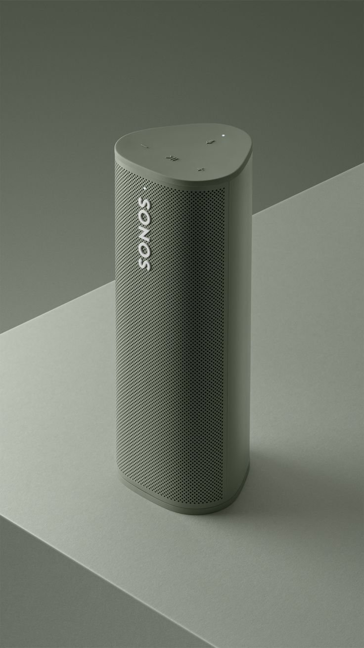
Most speakers look exactly like what they are: devices.
No shade intended. I love Bang and Olufsen designs.
They rarely integrate into the visual language or atmosphere of the home.
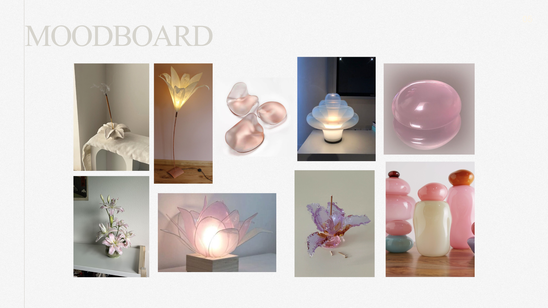
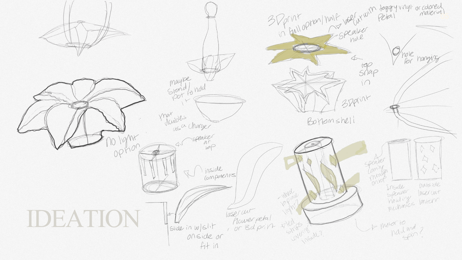
Ideation Process
During my ideation process, I looked a lot at organic materials and products such as ceramic, glass, and paper. Originally I wanted to include a light within the speaker itself.
In addition to the speakers organic flower form I also wanted to provide an added layer of function. I explored multiple ways the speaker itself could be transferred to a hanging object. I also looked into a zoetrope.
Prototyping
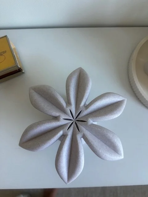
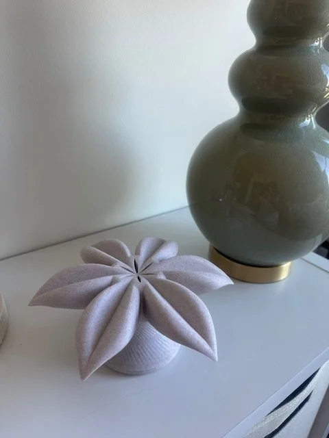
Began by designing the flower form in SolidWorks, using the conical shape to guide both the exterior form and internal structure
Hand-soldered the wiring to prototype the speaker and electronic components
Designed an internal component that functions as a tiered system, organizing the speaker and wiring within the flower body
Explored different closure methods, initially testing magnetic strips
Refined the final connection using a lip-and-groove system for a more secure and integrated fit

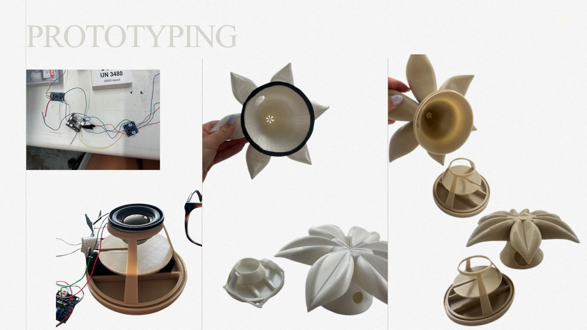
Working speaker hooray!
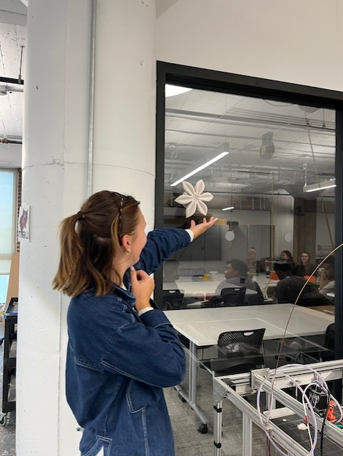
Design Iteration
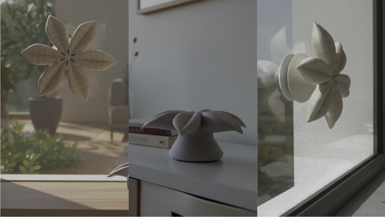
After building the final physical prototype, I revisited how Canopy might live in real spaces. The form evolved from a hanging object to one that could attach directly to windows or surfaces using a suction base, allowing the speaker to feel more integrated into the home environment.
UI/UX Integration
I wanted the app to enhance the experience of the speaker, not feel like a separate control tool
I designed the system with the whole home in mind, encouraging multiple speakers across different rooms
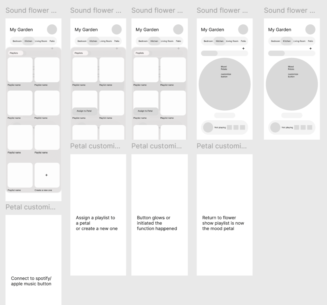
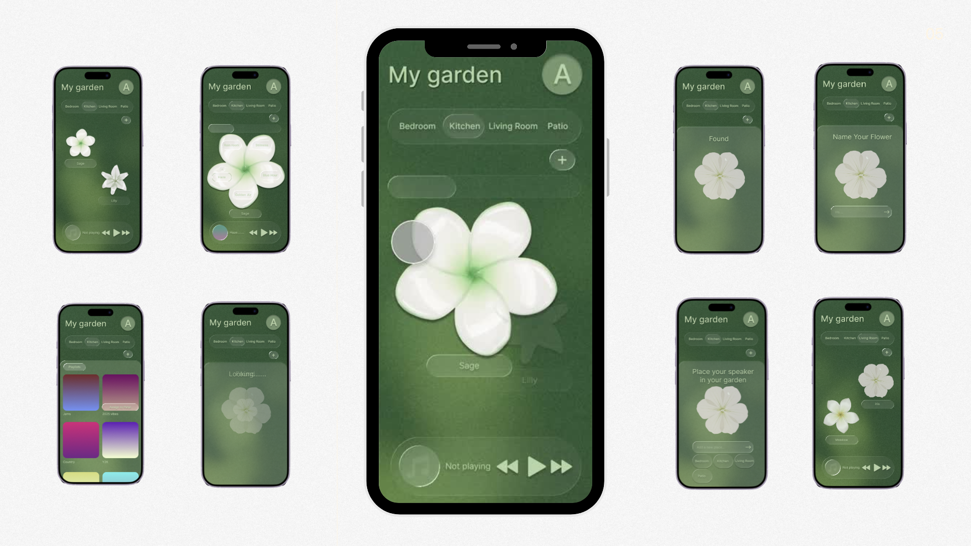
The flower shape became the foundation of the interface, directly translating the physical form into digital interaction
Petals function as selectable controls, each holding a curated, garden-inspired soundscape
Users can also sync their own music and playlists to individual petals, blending curated and personal listening in one place
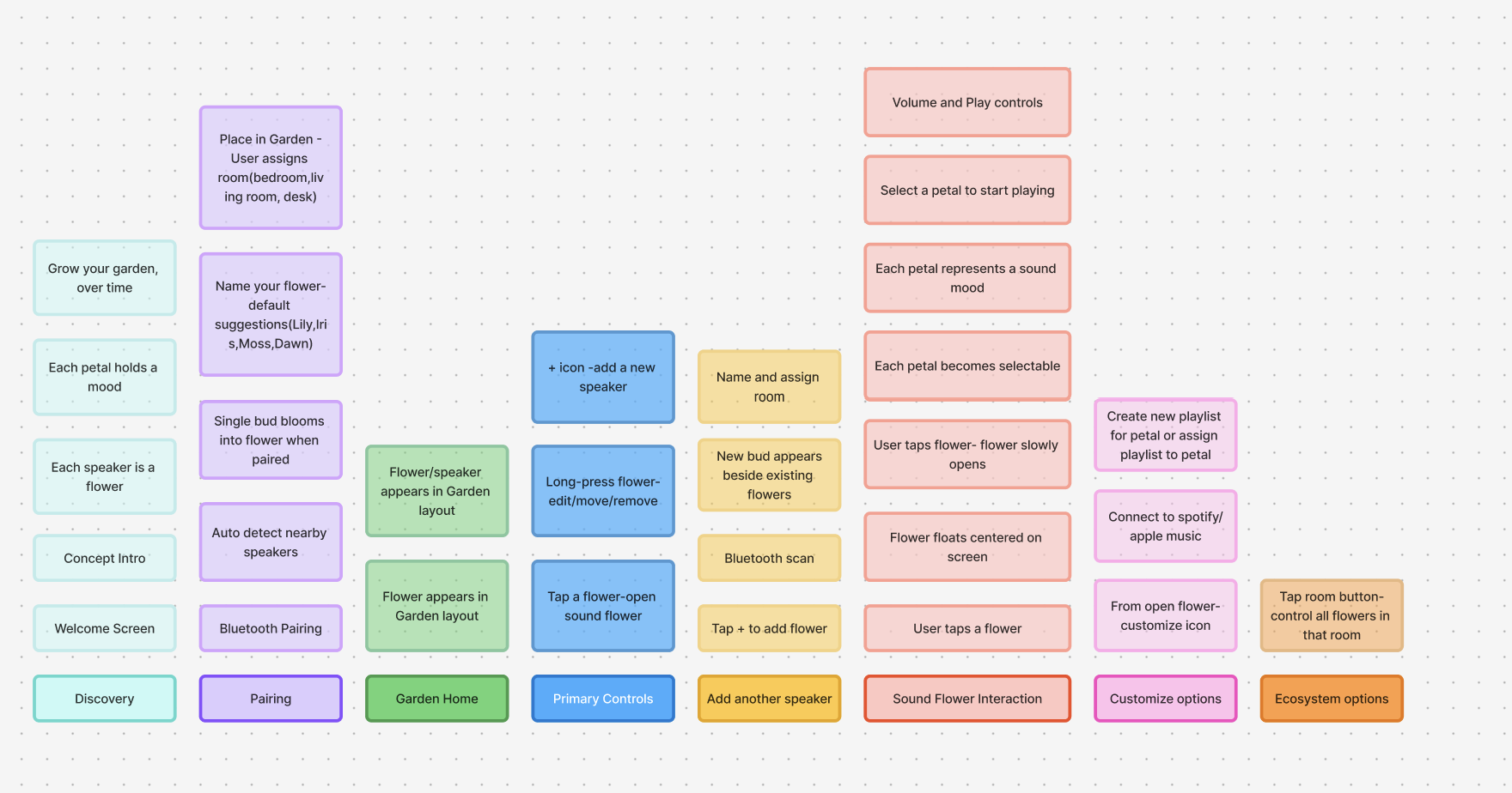
Process
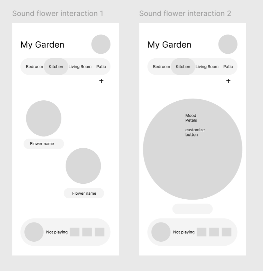
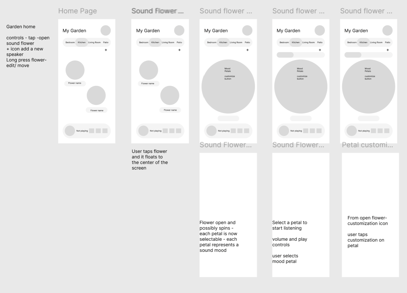
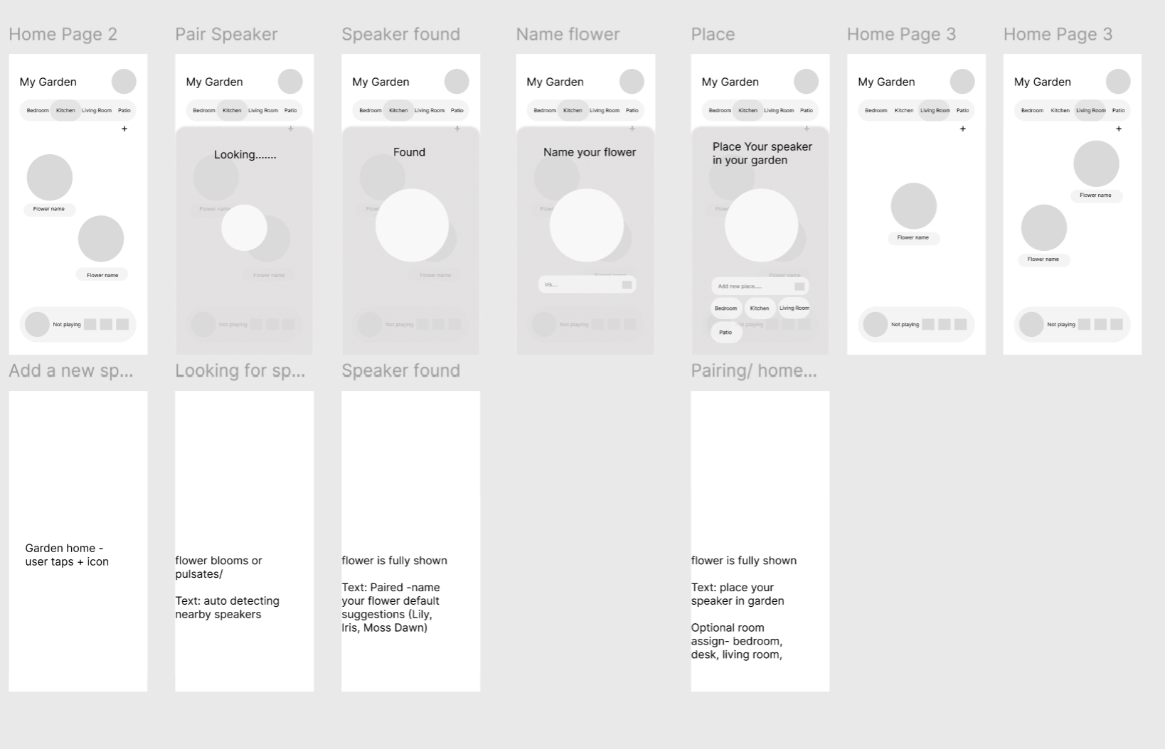
Wireframe Flow
I mapped the user flow to clearly communicate the system’s core interactions, from engaging with petals and music on the home screen to adding new speakers within the ecosystem.
The home interface was intentionally designed to feel simple and grounded, focusing only on essential controls like room selection and music playback. I wanted the experience to feel calm and intuitive at first glance.
The most complex design challenge was the interaction between the user and the flower speaker itself. Translating a physical, organic form into a clear digital interaction required balancing novelty with usability.
To address this, I rooted the interaction patterns in familiar systems like Spotify and Apple Music, allowing users to rely on existing mental models rather than learning something entirely new.
A key differentiator of the experience is the ability to sync personal playlists directly to individual petals. This allows users to customize their speaker in a way that feels expressive and personal, while still maintaining a structured interface.
I explored more explicit control-heavy solutions early on, but ultimately simplified the interaction to a single add button. This decision was intentional. Rather than overwhelming users with instructions, the design invites curiosity and guides them through a step-by-step discovery process, making the experience feel both intuitive and engaging.
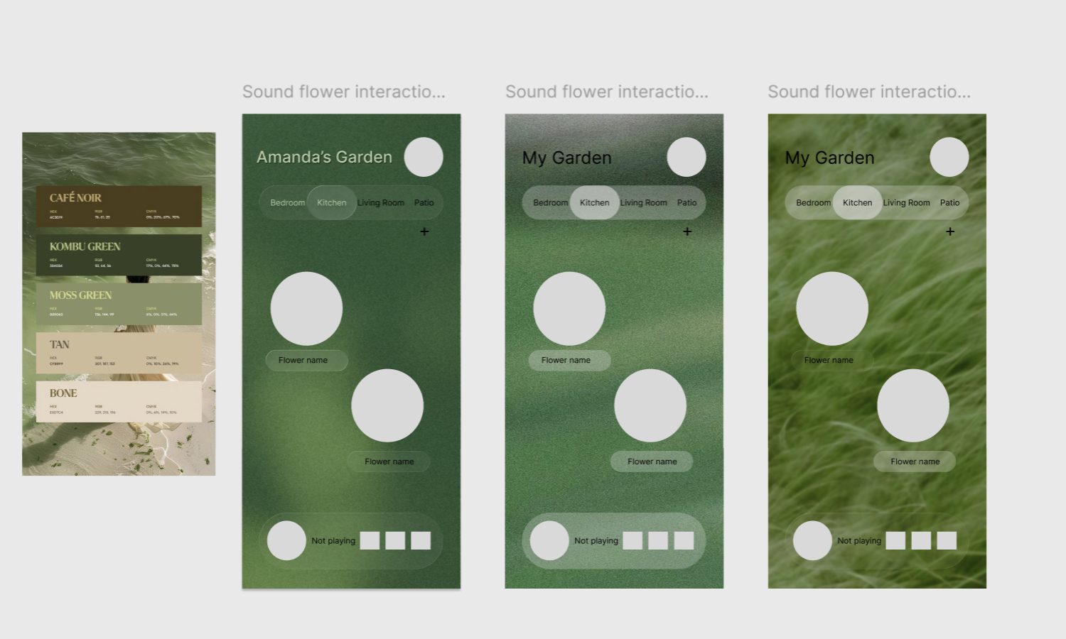
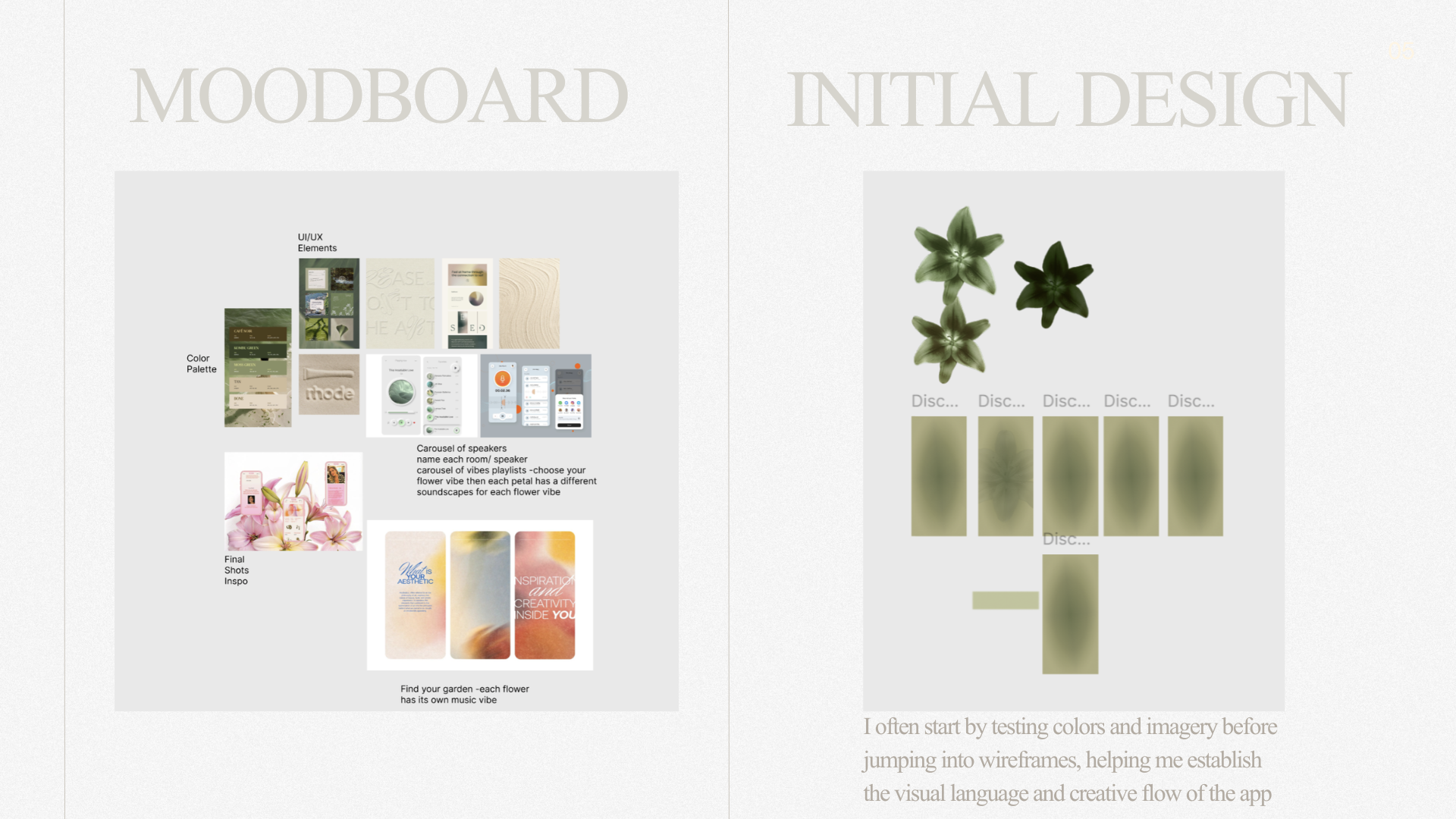
Visual Exploration
I wanted the interface to feel calm and grounded, pulling from nature, landscapes, and garden-inspired visuals
I focused on balancing these organic elements with familiar UI patterns so the app still feels intuitive and easy to use
Earthy color palettes helped tie the interface back to the form and presence of the speaker in the home
Typography was chosen to feel organic but still technological, reflecting both the sculptural form of the speaker and its function as a piece of home tech
I intentionally leaned on familiar design conventions, inspired by Apple’s design language, to create a sense of ease and familiarity